Regarding outdoor gear, your logo isn’t just a tiny mark; it’s the heartbeat of your brand identity. Think of it as the first hello, the initial handshake, or that nod of recognition across a crowded room—it’s what makes your brand memorable in a sea of competitors. A stellar logo can transform mere fabric and thread into a symbol of adventure, trust, and quality. In this bustling market, where every brand promises durability and reliability, your logo must stand tall and tell a story that resonates with the wild-hearted consumer. Here, we dive into why a killer logo isn’t just nice—it’s crucial for survival in the outdoor gear jungle.
Table of Contents
Understanding the Audience
To design a logo that clicks with outdoor buffs, you’ve gotta think like one. Outdoor enthusiasts value functionality, durability, and sustainability. When creating a logo, you’re not just crafting a design but speaking directly to these core values. A successful logo resonates visceral— like creating a secret handshake that says, “Hey, we get you.” By diving deep into demographic details (like age, location, and income) and psychographic profiles (such as values, hobbies, and lifestyle), you can tailor a logo that’s not just seen but felt. Let’s unpack how to forge this visual connection beyond aesthetics, crafting a symbol that outdoor enthusiasts will proudly wear as they conquer mountains.
Importance of Color in Outdoor Gear Logos
Have you ever wondered why some outdoor gear brands feel ‘right’ when you look at them? A lot of that has to do with color. Color isn’t just an aesthetic choice; it’s a psychological one that plays a massive role in branding. Take a forest green or earthy brown—these colors can evoke feelings of nature and tranquility, connecting directly with the heart of outdoor enthusiasts. Bright colors, like neon yellows or vibrant blues, grab attention and communicate safety and visibility, which are essential for outdoor gear. Brands like Patagonia and The North Face harness these colors to catch your eye and convey their deep-rooted connection to the great outdoors.
Shape and Symbolism in Logos
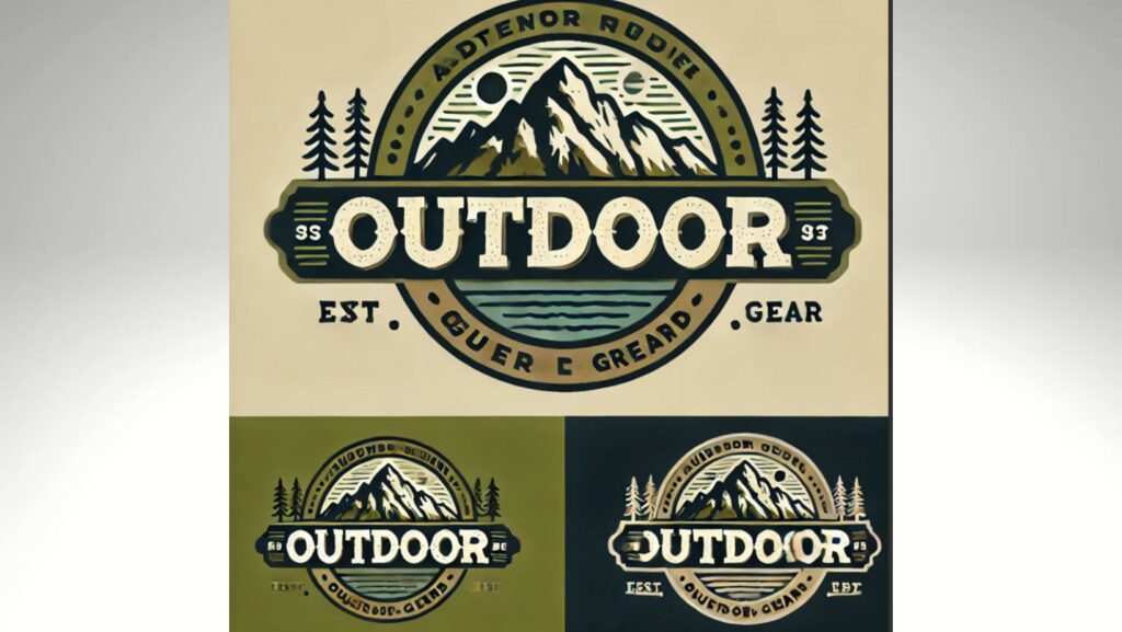
Shapes in logos are more than just pretty designs; they’re the silent ambassadors of your brand. Outdoor gear logos often use shapes that evoke strength and adventure, like triangles or circles, symbolizing stability and continuity.

Think of a mountain peak or a compass needle—these symbols instantly communicate ruggedness and the spirit of adventure. When selecting a shape for your logo, consider what aspects of the outdoor experience you want to emphasize. Is it the thrill of peak-bagging or the serenity of a lakeside campsite? Each shape tells a part of your brand’s story.
Typography and Brand Message
The font you choose for your logo does more than spell out your brand’s name—it also speaks volumes about your brand’s personality. For outdoor brands, sturdy, robust fonts that match the elements’ look often make the best fit. These typefaces should be clear and legible, even from a distance, making them practical for use on gear and promotional materials. Fonts like Tahoma or Verdana convey a straightforward, no-nonsense attitude, while something more rounded might add a touch of approachability and comfort. It’s all about matching the font to the vibe you want your brand to emit.
Incorporating Innovation and Tradition
BalancingBalancing modern innovation with a nod to tradition in outdoor gear in outdoor gear can make your brand fresh and dependable. Modern design trends often lean towards minimalism and sleekness, which can be great for technology-forward brands. However, incorporating traditional elements like classic fonts or natural motifs can evoke a sense of durability and reliability. Look at brands like Columbia or Barbour—they skillfully blend cutting-edge materials with designs that nod to their heritage, creating a sense of trust and quality that customers return to season after season.
Logo Placement and Usage
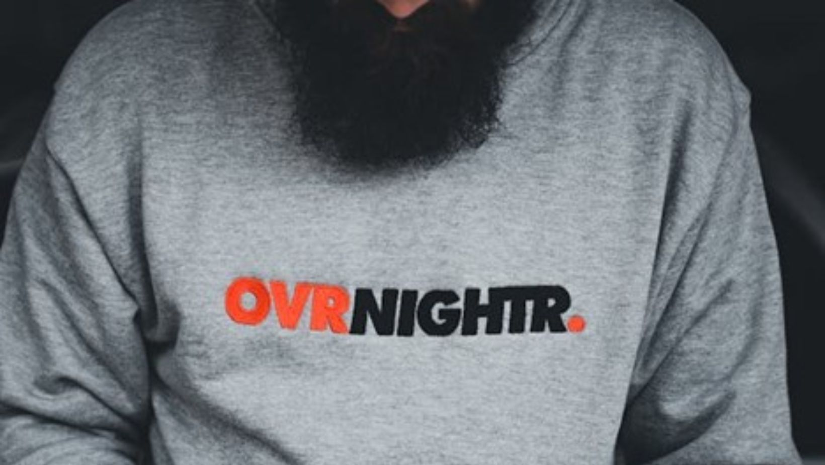
Where you place your logo is almost as crucial as the logo itself. Best practices suggest placing your logo in highly visible spots where it naturally catches the eye—think the left chest on a jacket or the front of a backpack. Scalability is key; your logo should be recognizable at any size, whether on a giant banner or a small zipper pull. Versatility is also critical—ensure your logo looks as good on digital screens as on physical products. This ensures consistent brand identity across all platforms, from your website to your wilderness-ready gear.
Design Process and Tools
Creating a standout logo starts with a solid process. Begin with brainstorming sessions that dive deep into what your brand stands for. Sketch out ideas—lots of them. Then, refine your designs digitally.

Tools like Adobe Illustrator or CorelDRAW are industry standards for vector creation, offering precision and scalability. For those starting out, creating design logos on Adobe Express provides user-friendly templates and design elements that can help bring your vision to life, ensuring your designs remain scalable and precise. No matter the tool, ensure it offers the flexibility and functionality required for intricate logo design.
Getting Professional Help
Sometimes, DIY just doesn’t cut it—especially when your brand’s image is on the line. Hiring a professional designer or a design agency can make a difference. They bring expertise in branding and design nuances that resonate with target markets. When collaborating with designers, communicate your vision clearly and stay open to their creative input. Ensure they understand your brand’s core values and audience. Effective collaboration results in a visually appealing logo that is deeply aligned with your brand identity.
Conclusion
In the competitive realm of outdoor gear, a well-designed logo is more than just branding—it’s an essential survival tool. It conveys your brand’s story, values, and promise of quality. Investing in a thoughtfully crafted logo enhances brand recognition and loyalty among outdoor enthusiasts. Remember, your logo is your brand’s flag, planted firmly in the ground of the market landscape. Make it count by dedicating the necessary time and resources to ensure it truly represents what your brand stands for and appeals to your target audience.


